We heckle the Fringe Poster
If there are three words that don’t come to mind when I consider the Adelaide Fringe Festival, they are minimalist, marketable and mild. And, yet, that seems to be the inspiration behind the brief for next year’s poster. From the competition brief:
[The] theme is Two Colour Collision. It can be interpreted anyway [sic] you like but must use only two bold colours.
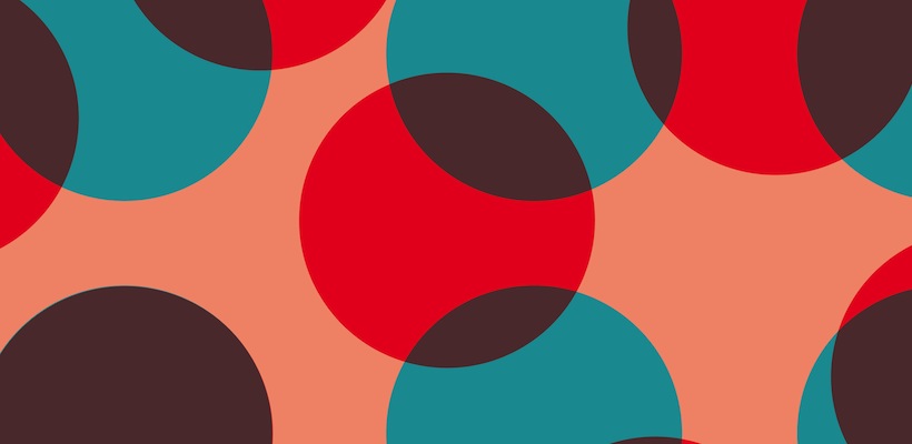
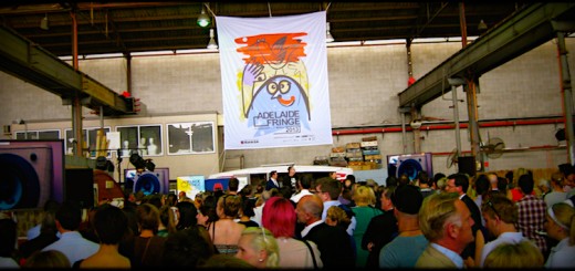
There are times when restrictions breed creativity, and times when they are just a straightjacket. This is the latter, and although winning designer Sharon Moreno did marvellously well to overlap the colours, and cleverly introduce a third colour into the design, the poster is about as bold as boiled potatoes.
Note: when the winning submission falls just outside the design brief, thanks to a clever cheat, it probably wasn’t the most well thought-out brief. Especially when, as you can see, they decided to add a fourth background colour for the purposes of the poster. (Part of me thinks the Fringe organisers realised this themselves, after seeing entry after entry of two-colour designs, and decided to go with something that managed to sneak more colours into the mix.)
Even understanding why this design was probably chosen, I still can’t muster up the sympathy to actually like it. I hate to think what Jo Public would have to say about it. It’s a bunch of dots, offset slightly, signifying absolutely nothing.
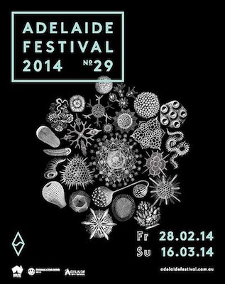
Compare the design for the Adelaide Festival design, which is similarly monochromatic – with the exception of some green, it’s entirely in white, black and grey – and yet it conveys so much more. It is elegant, simple, distinctive and symbolic. The organic designs are a reference to the Ediacara biota, the earliest form of complex life, which was first discovered in the Ediacara Hills in the Flinders Rangers. No, really, check it out:
[youtube=http://www.youtube.com/watch?v=xR-yMiyquG4&start=2160&w=400]
This is a huge point of pride for South Australians. Artistic director David Sefton said during the Adelaide Festival Program Launch that, when he discovered this, he wondered why we didn’t have it on the licence plates. And he was right to do so! Like the Adelaide Festival, it is something of worldwide importance; a remarkable record of what impressions us living creatures can leave on this world.
The Adelaide Fringe Festival, meanwhile, is for the punter that celebrates the misfit, likes a bit of grit in their culture, and is eager to engage with their art. They want to see designs that are artistic, adventurous and a bit left-of-centre. This poster fails to capture what the fringe is all about: a festival for the different, marvellous, unconventional acts that don’t really belong anywhere else in the arts scene. (Oh, and all those comedians trying out their material before the Melbourne Comedy Festival – that’s not a dig, we appreciate it!)
This is the Fringe primped up and washed out – desaturated and plasticky. The sort of stuff that makes you wonder if we’re not ready for a Fringe of the Fringe, where artists and audiences can let it all out and leave the polish and prestige for the Festival Centre crowd. (Again, not a slight, we love you guys too!) Come on, Fringe, stop giving us the sanitised stuff and show us what you’re all about!



I was just bitching about this on Sunday! Reminds me of something Windows would come up with as a background image…